SESSION A
Enhancing websites with CSS transitions (Unit 06)
What are CSS Transitions?
A few years ago you couldn’t gradually shift a text color. A button was either one size or another. Images were either transparent or opaque. There was no subtle changes from one state to the next. There were no transitions. CSS transitions allow for simple animations between CSS property values. You can set the specific transition-property you want to animate or you can use ‘all’.
CSS Transitions 101
- transition-property – specifies which CSS property (or properties) to animate. The default is ‘all’ to animate any property that is capable of being transitioned changes
- transition-duration – specifies how much time the transition animation takes to run.
- transition-delay – specifies the amount of time for a pause before the animation begins if not 0. Note, transitions do not have to have a pause before they begin.
- The transition-timing-function property allows you to control a transitions’s speed of progress. It accepts keywords: ease, ease-in, ease-out, ease-in-out, linear, or custom cubic-bezier() response curves.
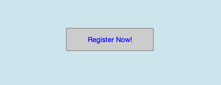
Look at the markup for the registration button. We want to target this button for our transition exercise:
<a class="register" title="Register now”]]>
Register Now!</a]]>
Take a look at the simple css code below. It is simply stating that :links should be blue and upon :hover they should turn red. Demo that code in your editor and notice how abrupt the change is.
a.register {
        color: blue;
}

a.register:hover {
        color: red;
}
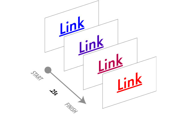
What we want to happen is that when we hover over the <a> element our color gradually shifts from blue to red.
Lets take a look at that code again but adding a simple transition from one color to another when a user hovers over a link. Just like any other CSS property, transitions are added directly to the element or selector they are applied to.
a.register {
        color: blue;
        transition: color .25s linear;
}

a.register::hover {
        color: red;
        transition: color .25s linear;
}
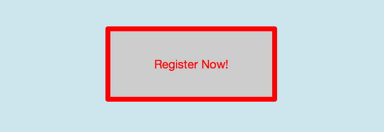
Now lets have a little fun. We’re going to build other property transitions to the button. First we switch the transition-property to ‘all’ instead of color. This will allow us to transition between all the css properties we specify. In this demonstration, when the user hovers over the registration button we will increase the width by 50px, the height by 25px, and the border will increase to 10px width and color red like the text. When the user hovers off the button the button will transition back to its default size and color.
a.register {
        color: blue;
        padding: 20px 0;
        width: 300px;
        border: 3px solid #999;

        transition: color .25s linear;
}

a.register::hover {
        color: red;
        padding: 50px 0;
        width: 350px;
        border: 10px solid red;

        transition: color .25s linear;
}
List of all the CSS properties that can be transitioned
| Property Name | Type |
|---|---|
background-color |
color |
background-image |
only gradients |
background-position |
percentage, length |
border-bottom-color |
color |
border-bottom-width |
length |
border-color |
color |
border-left-color |
color |
border-left-width |
length |
border-right-color |
color |
border-right-width |
length |
border-spacing |
length |
border-top-color |
color |
border-top-width |
length |
border-width |
length |
bottom |
length, percentage |
color |
color |
crop |
rectangle |
font-size |
length, percentage |
font-weight |
number |
grid-* |
various |
height |
length, percentage |
left |
length, percentage |
letter-spacing |
length |
line-height |
number, length, percentage |
margin-bottom |
length |
margin-left |
length |
margin-right |
length |
margin-top |
length |
max-height |
length, percentage |
max-width |
length, percentage |
min-height |
length, percentage |
min-width |
length, percentage |
opacity |
number |
outline-color |
color |
outline-offset |
integer |
outline-width |
length |
padding-bottom |
length |
padding-left |
length |
padding-right |
length |
padding-top |
length |
right |
length, percentage |
text-indent |
length, percentage |
text-shadow |
shadow |
top |
length, percentage |
vertical-align |
keywords, length, percentage |
visibility |
visibility |
width |
length, percentage |
word-spacing |
length, percentage |
z-index |
integer |
zoom |
number |


